Velvet Paintings: The Perfect Art for the 18th-Century Home?
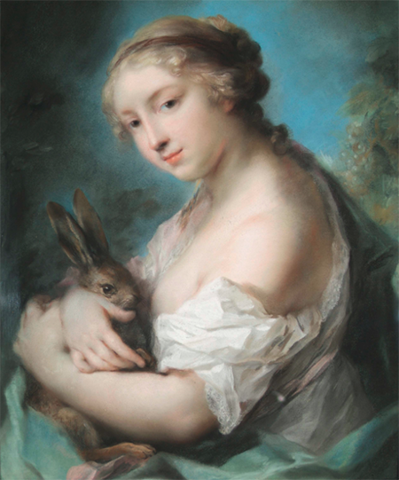
Rosalba Carriera, Girl with a Rabbit, ca. 1720-1730, Pastel on paper. Huntington Library, Art Collections, and Botanical Gardens, Adele S. Browning Memorial Collection, 78.20.28.
Today’s post is written by one of the founders of Home Subjects, Melinda McCurdy. She is Associate Curator of British Art at The Huntington Library, Art Collections and Gardens in San Marino, CA, and is the curator of the exhibition Velvet Paintings, which will be on view at The Huntington until September 7, 2015.
“The art of pastel painting reached its greatest height in 18th-century Europe. Praised for its bright white luminosity and velvety surface and constrained in size by its delicacy and the technical limitations of its materials, pastel possessed a decorative quality that suited the smaller-scale rooms of rococo interiors.”
This is how I described pastels for the exhibition Velvet Paintings that recently opened at The Huntington in San Marino, CA. It is a statement derived directly from the literature – as English pastellist Francis Cotes (1726-1770) declared in his “Notes on Crayon Painting,” pastels are “superlatively beautiful, and decorative in a very high degree in apartments that are not too large.” Not being a specialist in the medium or even in the art of the earlier eighteenth century, I took this statement at face value: of course pastels were the kind of picture best suited to display in the private interior. It’s only been since the exhibition opened that I began to ask myself why. Is it really a question of scale? What makes a pastel more “decorative” than a small oil painting? Of course, the luminosity achieved through the medium’s ability to diffuse light is lovely. But I imagine a freshly-varnished painting in oils would be equally as sparkling. Inventories suggest that pastel was a favored medium for the most intimate spaces in private houses: drawing rooms, dressing rooms, bedrooms, “cabinets,” and “closets.” Robert Walpole hung pastel portraits of his three sons by Rosalba Carriera in his “Yellow Drawing Room,” while George III’s bedchamber included Rosalba’s renderings of Winter and Spring. Clearly, it is not simply a matter of subject either – while pastel was widely used for portraits, some of Rosalba’s most popular works were allegories. Indeed, William Hoare spent a considerable part of his career making and selling copies of Rosalba’s allegorical compositions to his English patrons.
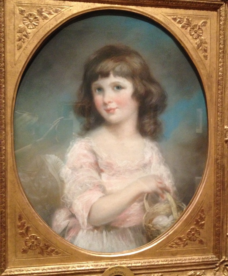
John Russell (British, 1745-1806), Anne Garnett, 1789, Pastel on paper. The Huntington Library, Art Collections, and Botanical Gardens, Adele S. Browning Memorial Collection, 78.20.38
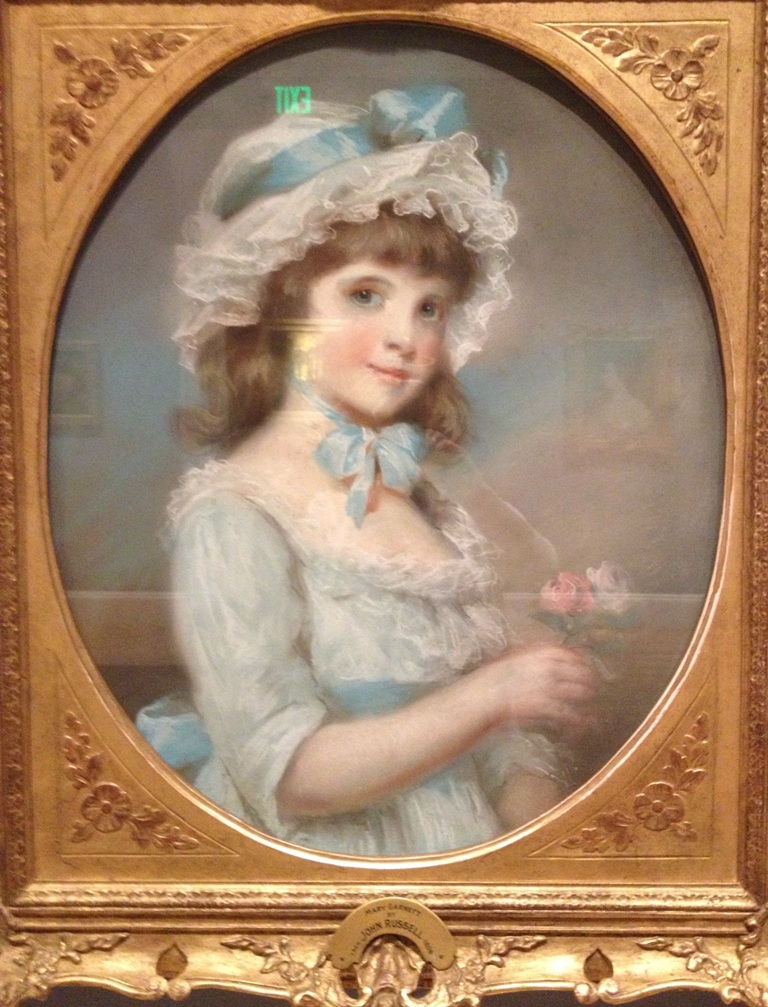
John Russell (British, 1745-1806), Mary Garnett, 1789, Pastel on paper. The Huntington Library, Art Collections, and Botanical Gardens, Adele S. Browning Memorial Collection, 78.20.37
The difference between Gainsborough’s exhibition pictures and most pastels is the venue in which they were seen. Gainsborough’s pictures were typically destined for display to the crowds at the Royal Academy before being removed into private houses (at least until he stopped showing his work there). The majority of pastel pictures were never seen in such a public context. They were instead hung in spaces that offered a much smaller range of distance for viewing than the walls of the Royal Academy, or even a stately drawing room. Currently on display in the Huntington exhibition are John Russell’s portraits of sisters Anne and Mary Garnett (1789), illustrated here. (They have not yet been photographed in color, so please excuse the snapshots taken with my phone in the gallery.)
These portraits were not intended for public display, and their private nature allowed for an economy of handling different from that typically displayed in Russell’s exhibition work. For example, only the lightest of touches are used to create the ruffles of the girls’ gowns. As Russell wrote, the drapery is made with “freedom, executing as much with the crayon and as little with the finger as possible.” The contrast between the carefully smoothed and blended pastel in the sitters’ faces and the looseness of the bodies is intentional, allowing the viewer to appreciate two distinctive techniques in one portrait.
The smaller scale of the domestic interior encouraged viewers to get close to pastels, to distinguish between their abstract and refined passages in a way that was impossible to do with oil paintings like those by Gainsborough, which required actual distance; it encouraged them to take pleasure in noticing the variety of unblended colors as their vision touched their imaginations, and perhaps even their hearts. Touch is intrinsic to pastel; making the image requires the artist’s caress. Russell himself speaks of pastel in sensory terms, contrasting its warmth to the coldness of oil painting. And while he intends this in the visual sense, if we accept the 18th-century notion that vision is touch, could the velvety quality of the pastel medium be the material correspondent to the actual physical-visual experience its powdery nature engendered, effectively recreating the warm and intimate pleasures of one’s domestic sphere? Maybe this is why pastels were the perfect kind of art for the 18th-century home. If you are a specialist in this field, please send me your comments as I am just beginning to think about these issues and their merits as a potential research project.