Unexpected Encounters with William Morris
A version of this post also appeared on “Useful and Beautiful,” the blog of the William Morris Society in the US.
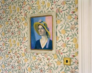
The interior of the Western Isles Hotel in Tobermory, the main town on the Isle of Mull. Credit: Mitch Epstein.
Over the past few months, I’ve had several unexpected encounters with William Morris. Flipping through a magazine or perusing a website, I’ll notice something familiar in the background, usually unnoted in the article that looks like a Morris design. It is a bit like seeing an old friend in an unfamiliar place—you’re not sure it is them, but then, on closer inspection, you wonder how you could have ever doubted it. The diversity of these contexts—in a travel article, in a review of contemporary art, and in a fashion magazine—suggest the ongoing power and importance of Morris’s work. Yet it also reminds that the meaning of a pattern is malleable and that in our current moment, it can take on specific—and sometimes contradictory—meanings.
The New York Times Style Magazine recently had an article on the Outer Hebrides of Scotland. As author Neel Mukherjee chronicles the difficulties in reaching the remote archipelago of St. Kilda on a pilgrimage to landscapes that inspired the great British filmmaker Michael Powell, the photographs by Mitch Epstein powerfully evoke the windswept landscape: a stone wall, a lone telephone booth, the rugged coastline. But then, there it is: William Morris’s Fruit wallpaper (also known as Pomegranate), first issued in 1866, on the walls of the Western Isles Hotel in Tobermory, the central town in the Isle of Mull. This encounter with Fruit reminded me of the enduring popularity of the design and well as its importance in Morris’s development as a pattern designer, as it was only the second or third pattern he designed. The interweaving of pomegranate and limes creates a seamless repeat, and the use of distemper colors heightens the flatness, signaling the rejection of illusionism in pattern design that would come to characterize mid-Victorian design reform. The pattern was popular during Morris’s own lifetime and can still be purchased today. The hotel’s website describes the establishment as the “Grand Old Lady” of the village, and it is unclear if the Morris paper is meant to signify the truth or the quaintness of this claim—or both. (by the way, wouldn’t you love to know more about that painting? It brings to mind the amazing and overlooked paintings in the recent True to Life exhibition. It answers the question: what if Gwen John were a Scottish Colourist?
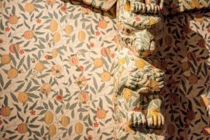
Nicholas Galanin | Imaginary Indian series, 2016, (installation view Art Gallery of Greater Victoria | It’s in the Making exhibition) | wallpaper, wood, paint | courtesy of the artist.
Fruit serves as both the background and the covering in the installation Imaginary Indian by the contemporary Tlingit/Aleut artist Nicholas Galanin. The artist uses mass-produced Northwest Coast masks and totems that he then covers in popular European prints from the eighteenth and nineteenth century. In one series, he used French toile, covering masks and hanging them on a toile-covered gallery wall, as the installation layers adaptation and appropriation: traditional forms manufactured for a tourist trade covered in a French pattern popular during the Enlightenment age of exploration but now one that carries a whiff of kitsch.
For a version of this work at the Art Gallery of Greater Victoria in British Columbia, Galanin covered a carved, winged totem poll with Morris’s Fruit. The wallpaper selection resonated locally, as rooms in the nearby Spencer Mansion, built in 1889 for Alexander Green, a banker in Victorian who made his wealth in the Australian gold field and now part of the Art Gallery of Greater Victoria, also feature the wallpaper pattern. As one reviewer suggested, the artist “brings to the fore the idea of indigenous cultural elements being transformed into commoditized objects created for the tourist dollar.” From this perspective, the ways in which Morris’s designs also wrestled with the idea of the commoditized object is lost, overcome by the ways in which the Spencer Mansion and the Art Gallery of Greater Victorian also participate in a tourist economy that manufactures totems and masks. If Fruit suggests Victorian quaintness of the Isle of Mull in the New York Times, then the same pattern participates in the commodified manufacture of indigenous identity in Galanin’s installation.
Manufacture and commodification also feature in a third iteration of unexpected encounters with William Morris: the Fall/Winter 2018 capsule collection for the Spanish luxury fashion brand Loewe, by its designer Jonathan Anderson, who hails from Northern Ireland. Anderson recounts that his interest in the work of William Morris began with self-identification. As he explained, “I have to design everything.” He felt a kinship with Morris’s understanding of design as “all or nothing,” “almost like a religion.”
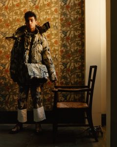
A look-book image featuring a parka, trousers, messenger bag and sneakers with William Morris’s Acanthus print. Credit: New York Times, Courtesy of Loewe
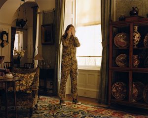
He adapted four iconic Morris patterns to designs for handbags, scarves, sweaters, and even a biker jacket with fox and foliage drawn from Morris’s Forest. As the designer explained, he wanted to restore a sense of Morris’s radicalism by uniting his designs with a punk aesthetic. He reimagines Strawberry Thief and Honeysuckle for cardigans and carry-alls, and he even managed to turn Morris’s Acanthus pattern into a kind of camouflage, with matching parka and trousers
The photographs for the look book were taken in the Morris & Co. interiors at Standen House and Garden, the country retreat of James and Margaret Beale in the Sussex countryside now operated by the National Trust, furthering the idea of a Morrisian gesamtkunstwerk. (interestingly, the website notes that the house is “dressed” for a weekend stay in 1925, making the Morris & Co. interiors seem slightly outdated–another example of Morris designs as “Grand Old Lady.”) For me, this unexpected encounter—like running into William Morris at Barney’s in New York—is the most fun and the most disappointing. Fun because it is exciting to see Morris’s designs reimagined in this way, design reform dictums about the suitability of patterns for specific purposes notwithstanding. Morris is part of a longer history that unites considerations of dress and the body with conceptions of the body politic, reminding us that the “artistic” dress of Jane Morris was as radical in its day as the anarchic chic of punk. When the collection debuted as a “pop-up” at Liberty in London, it was marketed as “William Morris Meets Punk,” with specialized mannequins sporting bright orange spiked mohawks. At the same time, most of these items are listed as “price upon request,” the fashion-friendly way of saying: “if you have to ask, you can’t afford it.” A velvet pouch featuring a shy hare from Forest will set you back $1,250.
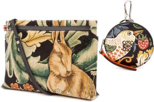
Loewe’s velvet T-Pouch Rabbit bag, $1,250, and its William Morris Strawberry-Thief print charm, $450. Credit: New York Times/Courtesy of Loewe.
This price-point only serves to re-inscribe a tired critique of Morris’s designs: the socialist designer still managed to make very expensive things. The Loewe collection, like much fashion, flirts with the absurd. While Galanin’s Imaginary Indians uses Fruit to raise questions of identity and commodity, the Loewe collection seems to confuse commodity and identity.
But it leads me to ask: Where will Morris show up next?
