Furnishing the Museum
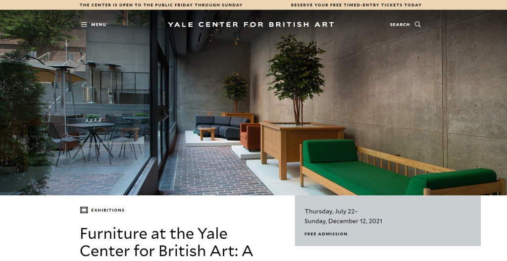
Screenshot of YCBA website. Inset photo: View of the Lower Court and the exhibition Furniture at the Yale Center for British Art: A Selection, photo by Richard Caspole
NB: This exhibition has been extended through March 27, 2022, so there is still time to see it. –ANR
Currently on view at the Yale Center for British Art in New Haven is an exhibition of furniture designed for the building curated by Rachel Hellerich. The exhibition includes examples of a variety of pieces that provide seating: chairs, sofas, and benches, as well as small tables and planters for living trees that were originally scattered through the galleries. The pieces in the exhibition were made by a range of designers and manufacturers working in a modernist design vocabulary appropriate to architect Louis Kahn’s vision for the building, which opened in 1977.
This exhibition pinpoints one of the core preoccupations of Home Subjects: the overlapping histories of the domestic interiors, churches, and civic buildings where artworks were seen in the past and the purpose-built institutional settings where they are often displayed today. While a number of scholars have written about how the architectural forms of museums relate to a variety of older building types, including ancient temples, medieval churches, and royal palaces, the furniture that populates almost every modern museum or gallery tends to be overlooked. The YCBA makes a step toward correcting this imbalance by addressing the gallery’s furniture as significant objects in their own right.
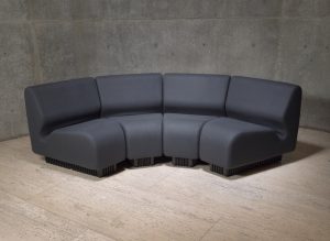
Don Chadwick, Modular seating for Herman Miller, 1974, reissued in 2015 (group shown here), British Wool, foam, plastic, Yale Center for British Art, photo by Richard Caspole
The essay that accompanies the exhibition notes that after Kahn died prior to the Center’s completion, architect and interior designer Benjamin Baldwin was hired to furnish the building. The essay explains that Baldwin “strove to create” the feeling of a “domestic interior” in the galleries, choosing “versatile, comfortable seating” for its spaces, including modular seating created by designer Don Chadwick for Herman Miller in 1974 (Chadwick also co-designed the widely-loved Aeron desk chair.)
The idea that a gallery should offer “comfort”—itself an idea that must be historicized—in any way akin to that found in a domestic interior is one that developed only slowly over the course of several centuries. A “gallery”, understood as a long, narrow room often pierced by windows along an exterior wall, became a regular feature of large private houses in the sixteenth century. Early galleries had multiple uses, as did many rooms in this period; their length made them convenient for indoor exercise, but they could be adapted for use on a variety of occasions, including the diplomatic and ceremonial. Their significance as sites where important visitors could be received and entertained encouraged the display of art on their walls, especially portraiture. In the seventeenth and early eighteenth centuries, paintings, often with mythological themes, were set into cartouches adorning ceilings or walls, and galleries were further embellished with mirrors and gilded woodwork.
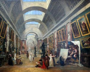
Despite the attention given to walls and surfaces, through the late eighteenth century the interior spaces of rooms designated as galleries were generally only sparsely furnished. Seats and tables could be arranged in the rooms according to occasion and need, but there was no established pattern of furnishing, and this was especially true of galleries that were open to the public. Andrew McClellan has described how Jacques-Louis David argued for the removal of decorative arts from the gallery of the Louvre, having declared them to be “a vain assemblage of frivolous luxury objects” whose only contribution to the gallery’s interior could be to distract art students from the business at hand. As galleries became transformed into places where art was displayed for its own sake, and organized according to the intellectual framework provided by national schools, furniture as a decorative object did not form part of their mission. French painter Hubert Robert’s View of the Grand Galerie, dated 1796, implies that at first many furnishings did remain in the the gallery, prominently the massive pier tables that lined the walls. These tables visually anchor the history and religious paintings that hang above them while simultaneously displaying a few objets d’art. Meanwhile, visitors are pictured using plain, easily movable chairs and stools on which to perch and rest their drawing paper and supplies; one young artist sits on the floor.
A space devoid of furniture, however, did not adequately accommodate the human bodies who populated it. When novelist Maria Edgeworth visited the Louvre in 1802 she observed: “I was entertained but tired with seeing so many pictures to be admired and all in so bad a light that my little neck was almost broken and my little eyes almost strained out in trying to see them.” Many gallery visitors in this period described the physical exhaustion that seemed an inevitable by-product of looking at art. Galleries often relied on sky-lighting for illumination, but the quality of light then depended on season and weather. Gallery-goers of both sexes also had to cope with layers of clothing made of inflexible fibers, which when combined with unsupportive footwear and a dearth of seating, interfered with their ability to lose themselves in the appreciation of the pictures on display. Edgeworth had a better idea—to look at prints of the paintings in the Louvre after returning home to Ireland. “I shall not mention the pictures we liked best,” she wrote to a friend, “because I have marked them in a catalogue which I hope soon to look over with you upon Black Castle or Edgeworthstown sofa cushioned up as we were in the happy days when we read Belinda together.” In Edgeworth’s letter, we find a spark of the idea that the comfort provided by a well-stuffed sofa could enhance, rather than detract from, the experience of art. (I wrote about Edgeworth’s visit to the Louvre here, in 2016.)
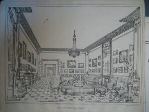
J.M.W. Turner, Mr. Fawkes’s Gallery, in A collection of water colour drawings, in the possession of Walter Fawkes, Esq. (Benjamin Bensley, 1819). National Art Library, Victoria & Albert Museum, London.
In the early nineteenth century, furniture designed specifically for galleries began to make an appearance, though there is much work to be done on this topic. In 2010 I explored one such example, a piece of furniture that appeared in an interior view of Walter Fawkes’ gallery in London. The view, made after a drawing by J.M.W. Turner, features an unusual large square upholstered settee. I have been able to find no other example of such a seat during the Regency. It may, however, be related to the category of furniture called ‘ottomans,’ which were popular in this period because of their functionality as comfortable seating and their fashionably exotic associations with the culture of the Ottoman Empire. Later in the nineteenth century, such oddly-shaped settees, sofas, and couches begin to appear regularly in views of gallery interiors, and their descendants can still be found in many institutions, such as at the National Gallery in London.
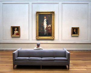
A man sits on a couch while visiting the National Gallery of Art’s West Building, located on the National Mall in Washington, D.C. 14 April, 2010. Wikimedia Commons.
In the second half of the twentieth century, many museums and galleries began to eschew these Regency and Victorian precedents in favor of furnishings with clean, modern lines, seeking to avoid distracting from the art on display and distancing the gallery’s furnishing with the “frivolous luxury objects” that David wished to banish from the Louvre’s interior. The example shown at left suggests the commodious but self-effacing nature of many of these objects. (Other rooms at the National Gallery in Washington D.C. feature plain wooden benches. A recent encounter with one of these benches served as a reminder that they provide only a modest respite in the middle of a large exhibition.) In this photograph, an anonymous man rests on the sofa while contemplating David’s The Emperor Napoleon in His Study at the Tuileries (1812). The NGA sofa, sleek and gray, forms a stark contrast with the gilded empire style desk and chair represented in David’s painting. The leg of the desk is carved in the form of a lion, the chair upholstered with rich crimson velvet and embroidered with bees, which were emblematic of Napoleon’s reign. Replacement sofas were commissioned in 2015, as the current fleet had begun to show its wear, but the new version, while not identical, follows the model of its predecessor very closely.
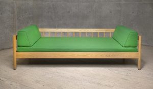
CI Designs, 124 Sofabed (front view), no date, ash, nylon, and foam, 26 ½″ H x 78″ W x 33″ D, Yale Center for British Art, photo by Richard Caspole
At the same time, as the YCBA exhibition recognizes, this mid-century furniture can now be seen as an object of design in its own right. Elegant and commodious, it is no longer as invisible as it once was, offering its own charms and claiming its own place in the history of modernism. Furniture occupies an important role in the histories of the experience of viewing art, whether it encourages visitors to linger in one place, or offers a hard reminder to keep moving.
