Animating Interiors: Walt Disney at the Metropolitan Museum of Art
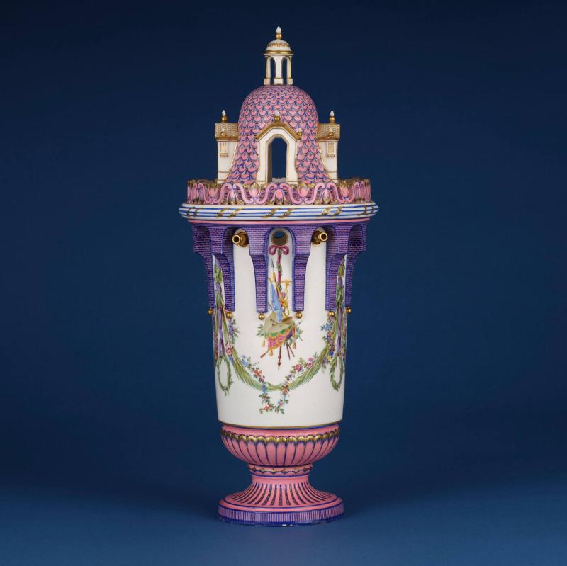
Sèvres Porcelain Manufactory (French, active from 1756 to the present), Lidded Vase [2 of 2], soft-paste porcelain, overglaze pink and blue ground colors, polychrome enamel decoration, gilding, ca. 1762, The Huntington Library, Art Museum and Botanical Gardens
Exhibition and catalogue elaborated upon a number of themes that connect Disney to eighteenth-century decorative art: Disney’s embrace of northern European aesthetic traditions, the nature of fine art versus craft, workshop practices, and a fascination with the imagination of children. Of specific interest to us is the notion that the house and its interior, and in particular the conception of furniture as a literally and figuratively ‘animating’ source of the interior’s logic, was a key source of inspiration for Walt Disney and the artists he employed throughout his career. The exhibition begins with a film Disney made when he visited Versailles in 1935. We were struck by the text of the label, which records that Disney’s sister-in-law Edna, who was part of the group, wrote that they “drove out to Versailles to see Louis XIV’s old home. It is magnificent.”
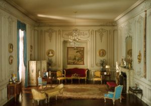
Narcissa Niblack Thorne (Designer), French Boudoir of the Louis XV Period, 1740-60, mixed media, Interior: 18 1/4 × 24 3/4 × 23 1/8 in. (45.625 × 61.875 × 57.8125 cm) Scale: 1 inch = 1 foot, Art Institute of Chicago, Gift of Mrs. James Ward Thorne
Of course, Edna’s notion that Versailles is a “home” reflects an early twentieth century, American framing of Europe’s most illustrious court, where up to 10,000 people resided during its heyday. The inherently miniaturizing connotation of the word is echoed on the facing wall, where vitrines displaying some of Walt Disney’s large personal collection of dollhouse miniatures is on display, along with one of the minature historic interiors artist and socialite Narcissa Niblack Thorne made in the late 1930s, which also fascinated Disney.
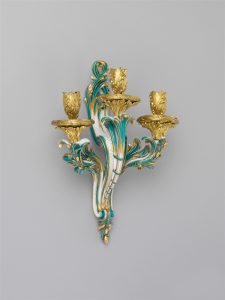
After a design by Jean-Claude Duplessis (French, ca. 1695–1774, active 1748–74), Sèvres Manufactory, wall sconce (bras de cheminée) (one of a pair), ca. 1761, Metropolitan Museum of Art, Gift of Samuel H. Kress Foundation, 1958
Disney’s attempt to contain and tame the class implications of the societies that originally gave rise to such interiors is a theme that emerges throughout the exhibition, which looks in detail at three films: Cinderella (1950), Sleeping Beauty (1959), and Beauty and the Beast (1991). The concept art for all three was explicitly inspired by the arts, particularly decorative arts, of northern Europe. Cinderella drew on French art and design from the mid-eighteenth through the late nineteenth centuries, Sleeping Beauty looked to medieval tapestries and illuminated manuscripts, and Beauty and the Beast to rococo designs for clocks, candlesticks and furniture. One of the exhibition’s signature objects, depicted on posters and marketing materials and at the top of this post, is a set of Lidded Vases in the form of towers made by the Sèvres Porcelain Manufactory around 1762. The exhibition reunites two sets of the vases, one from The Huntington Library and the other from The Met’s own collection. To contemporary eyes, they are wholly unexpected, combining the iconography of fortified castle architecture with delicately painted military trophies and garlands of flowers. The Huntington’s set is painted in a purple and pink color scheme that seems to precisely foretell the tastes of late twentieth-century Disney fans–though as the label points out, even some eighteenth-century painters felt frustrated by “a nation that wants everything colored pink”.
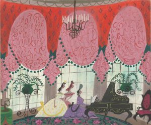
Mary Blair (American, 1911–1978), Cinderella’s stepmother and stepsisters
rehearsing, 1940s, Gouache, graphite, and pastel on board, Walt Disney Animation Research Library
The specific and subtle political, artistic, and social significances conjured by each of these historical periods and categories of object would not have been apparent to American general audiences at the time, who would have understood them as a shorthand for wealth in the broadest sense. Yet a running theme in all three films is the traversal of class barriers represented by the titular characters. In Cinderella and Beauty and the Beast in particular, admission to a grand, previously out-of-bounds interior space is the point on which the narrative hinges. For American audiences in the second half of the twentieth century, the dream of upward mobility and class permeability that these films represent was a powerful tale in itself and may help explain why these are amongst Disney’s most beloved films (and played an important role in launching the ‘Princess’ phenomenon). Disney’s interest in interior spaces, and how they shape the trajectories of heroines and other characters, is reflected in many of the examples of concept art for all three films that are included throughout the exhibition. Mary Blair’s concept art for the Drawing Room at Cinderella’s house depicts an over-the-top interior, complete with crimson swags of drapery and ferns on plant stands, implying how her stepmother, and by extension, stepsisters, have squandered the family’s wealth.
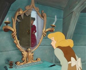
Walt Disney Studios,
Cinderella at her bedroom mirror as Lady Tremaine locks her in, watercolour and gouache, 1950. Photo courtesy of MutualArt
The exhibition includes only concept art that depicts these elite spaces, but out of curiosity we wondered how Disney depicted the impoverished Cinderella’s own room. It too contains references to the objects designed and made for the upper classes; for example, Cinderella’s mirror is clearly understood to be a cast-off, its glass surface cracked revealing the plain materials below. Likewise, a table by her small wooden bed is missing one of its delicately s-curved legs. Similar references to furniture and interior design pervade the film, and are an important vehicle for storytelling.
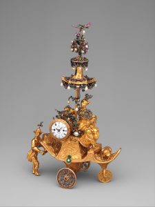
James Cox (British, ca. 1723–1800), Automaton in the form of a chariot pushed by a Chinese attendant and set with a clock, Case: gold with diamonds and paste jewels set in silver, pearls; Dial: white enamel; Movement: partly gilded brass and steel, wheel balance and cock of silver set with paste jewels, 1766, The Jack and Belle Linsky Collection, 1982, Metropolitan Museum of Art
This is particularly true in Beauty and the Beast, in which objects in the Beast’s castle spring to life–major characters take the form of a candlestick, a teapot, and a pedestal clock–and invite her into the world of an enchanted interior. The exhibition traces in detail the centralilty of anthropomorphism to eighteenth-century design, the fluidity and dynamism of its s-curves inspired in part by the movement of the human body. The exhibition also describes the modernity and luxury of these objects. Their preciousness stemmed in part from the rarity and expense of materials from which they were made, but no less from the fact that they represented the cutting edge of technology and technique. It should be said however, that the significance of these aspects of eighteenth-century design were not translated into the language of Disney. If anything, contemporary audiences would have understood the inhabitants of the Beast’s castle as “antiques,” their value stemming from age rather than novelty. In the film, Belle’s father is depicted as an inventor of kooky, proto-industrial Rube-Goldbergesque devices that do little to endear him to the local community. (As the catalogue points out, in the 2017 live-action remake, he is transformed into a creator of whimsical, mechanical devices of the sort that would have been welcome at a royal court, similar to the automaton designed by James Cox that appears in the exhibition. Cox’s automaton was commissioned by the East India Company for presentation to the emperor of China.)
Despite Walt Disney’s own claim that he did not embed any deep significance into his own movies–exhibition and catalogue quote him as having said, “I make pictures for entertainment, and then the professors tell me what they mean”–this exhibition makes clear that the material culture of the past held sufficient resonance in the cultural imagination that it could be used as a springboard for visualizing stories that spoke eloquently to twentieth-century audiences. We are hopeful that the selection of astonishing eighteenth-century objects included in the exhibition have won them a new generation of fans, and sparked curiosity about what stories they have to tell us about the past.